
You’ve done the hard work—your ads are running, people are clicking, and traffic is flowing.
But the results? Not what you expected.
Here’s the good news: the problem isn’t your product. And it’s not your audience either.
It might just be the page they land on.
Fix that one page—and you could turn visitors into customers, clicks into conversions, and effort into real growth.
Hey! Are You Using Your Website as a Landing Page?
That’s your first mistake. Your homepage is built to inform. A landing page is built to convert.
They’re not the same thing.
Oh, what exactly is a landing page?
To begin with, it’s a page with just one job. Sell one thing. Get one action.
No menu. No distractions. No wandering around.
Just one message and one button.
This is why it works better.
Your website is like a Swiss Army knife; lots of tools, but not always the right one for the job.
A landing page is a laser. It cuts through the noise.
People land. They see your offer. They act. Period.
Two different Landing Page Styles Get Results
- Lead Gen Pages
These collect contact details.
You offer something useful: a free trial, a discount, or a guide.
They give you their name and email.
You get leads. They get value. Everyone wins.
- Click-Through Pages
These pages warm people up, then send them to buy.
No forms, just one big button. “Book a demo.” “Buy now.” “Start free.”
Perfect for sales-focused pages.
Here is What Makes a Landing Page Work.
- A Headline That Hits
Clear. Bold. Straight to the point.
They should know exactly what you’re offering in five seconds.
- Copy That Sells
Short sentences. Big benefits.
No fluff. No jargon. No filler.
- A Call to Action That Pops
Make the button impossible to miss.
Use action words. Place it early. Repeat it smartly.
- A Form That Doesn’t Scare People
Only ask what you need.
The shorter the form, the higher the chances they’ll fill it out.
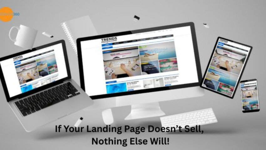
- Images That Do Their Job
Don’t just decorate—demonstrate.
Show what they get. Use real visuals, not stock fluff.
- Social Proof
Reviews, ratings, and testimonials.
If others trust you, new visitors will too.
- Mobile-Friendly Design
Half your traffic’s on their phone.
Ensure your page loads quickly and works smoothly on every screen.
Want to Build a Landing Page That Converts?
Start Here:
- Use a landing page template to save time.
- Match your page to the ad that brought people in.
- Always keep your audience in mind. What do they care about? Speak directly to that.
Follow these Best Practices
✔ Know your goal. One page = one purpose.
✔ Talk to your audience like a human, not a brochure.
✔ Make your offer feel too good to ignore.
✔ Keep the design clean and obvious.
✔ Test everything: headlines, images, buttons, and length.
Common Questions Answered
- Can any page be a landing page?
Sure. But real landing pages have one goal, no menu, and a single action.
- Can I have one without a website?
Absolutely. Perfect for campaigns or quick launches.
- Do I need a domain?
It helps. But you can also look at tools that give you a link page.
- How long should it be?
As long as it needs to be. Not one word more.
- How many can I have?
As many as your campaigns, audiences, or products need.
More pages = more chances to convert.
Do It Yourself or Outsource?
Ask yourself:
- Am I building one or many?
- Do I have design skills or time?
- What’s my budget?
Use a landing page builder if you’re going solo.
Hire an agency if you want it done faster or professionally.
Looking at Better Results? Improve the Experience
- Ensure the content aligns with your ad or promotion.
- Keep your page fast. People leave if it takes more than 3 seconds.
- Design for phones first. Most people scroll on mobile.
- Remove clutter. Keep your eyes on the goal.
Common Mistakes That Kill Your Conversions
- Too much info
Keep it tight. One page, one story, one offer.
- Weak CTAs
“Click here” is boring. “Get My Free Guide” is clear.
- No mobile version
If it looks bad on a phone, it won’t convert. Period.
How Do You Know If Your Landing Page Is Working?
- Conversion Rate: The % of people who take action. 2–5% is average. 10%+ is gold.
- Bounce Rate: High is bad. People left without doing anything.
- Time on Page: More time usually means more interest.
- Traffic Source: Where are people coming from? Focus on what’s working.
Finally, it’s the Focus that Wins
Landing pages work because they remove the noise. They give people one thing to do and guide them there fast.
No confusion. No extra steps. Just action.
Want to see what a good landing page feels like?
Comment below.